Hidden Roadblocks: The Psychological Friction Killing Your Landing Page Conversions

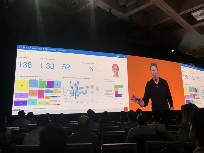
Photo: ChloroCatBench, CC0, via Wikimedia Commons
You have invested in paid traffic. Your targeting is precise. Analytics confirm that visitors match your ideal customer profile almost exactly. And yet, conversion rates remain stubbornly low. The leads are not coming through. The purchases are not completing. Something is wrong, but the dashboard offers no clear answer.
The culprit, in many of these cases, is not your audience — it is your page itself. More specifically, it is the psychological friction embedded within the experience you are asking visitors to navigate. Understanding what friction actually means in a digital context, and why it operates so powerfully against conversion, is essential for any business serious about turning traffic into revenue.
What Psychological Friction Actually Means
In behavioral science, friction refers to any force that increases the effort required to complete an action. On a landing page, friction is rarely a single glaring problem. It is more often an accumulation of small cognitive stresses — moments where a visitor must pause, evaluate, question, or second-guess. Each of these micro-hesitations erodes momentum and increases the probability of abandonment.
Research from the Baymard Institute consistently shows that users abandon digital experiences not because they lack intent, but because the process of completing their goal feels effortful, unclear, or risky. That distinction matters enormously. High-intent visitors are not lost because they changed their minds. They are lost because your page made completing the action feel harder than walking away.
Form Length and the Effort Calculation
One of the most well-documented sources of friction is the lead capture form. Businesses frequently underestimate how quickly form length shifts a visitor's internal calculation from "this is worth it" to "this is too much."
Every additional field a visitor encounters triggers a small but real cognitive cost. Name, email, phone number, company, job title, company size, industry — each addition is another micro-decision, another moment where the visitor weighs the value of what they are receiving against the effort and exposure they are accepting. When that calculation tips toward effort, abandonment follows.
The practical implication is not that all forms should be reduced to a single email field. It is that every field on your form should be justifiable in terms of the value it creates for the visitor at that specific moment. Progressive disclosure — asking for minimal information upfront and gathering additional details later in the relationship — is a proven technique for reducing this form of friction without sacrificing data quality.
Decision Paralysis and the Paradox of Options
Psychologist Barry Schwartz popularized the concept of the paradox of choice: the counterintuitive finding that more options often lead to less satisfaction and less action. Landing pages that present multiple competing offers, varied pricing tiers without clear differentiation, or several different calls to action simultaneously are engineering decision paralysis directly into the experience.
A visitor who is unsure which option applies to them will frequently choose none. Rather than risk making the wrong selection, they defer the decision entirely — and that deferral almost always means leaving the page.
Effective landing page design eliminates this paralysis by committing to a single, primary conversion goal per page. If your business offers multiple products or service tiers, the role of the landing page is to guide the visitor toward one specific action appropriate to their context. Clarity of purpose is not a creative limitation; it is a conversion imperative.
Trust Signals: When Their Absence Speaks Louder Than Their Presence
Conversion requires a transaction of trust. Whether a visitor is submitting a form, entering payment details, or simply sharing their email address, they are accepting a degree of vulnerability. In the absence of credible trust signals, the psychological default is caution.
Many landing pages underinvest in this dimension. They assume that a professional appearance is sufficient to establish credibility. It rarely is. Visitors in 2024 have been exposed to enough polished-looking scams and disappointing purchases to be appropriately skeptical of design alone.
Meaningful trust signals include verifiable third-party reviews, recognizable security badges in proximity to form fields, specific client testimonials with full names and company affiliations, and transparent privacy disclosures near data-collection points. The specificity of these elements matters. Vague endorsements and generic star ratings carry far less psychological weight than concrete, attributable social proof.
The Cognitive Load of Unclear Value Propositions
Friction also emerges when visitors cannot quickly determine what they will receive in exchange for their action. A headline that is clever rather than clear, a hero section that prioritizes aesthetics over explanation, or a call-to-action button that reads "Submit" instead of describing an outcome — each of these forces the visitor to do interpretive work that they did not agree to perform.
Cognitive load theory tells us that working memory is limited. Every ounce of mental effort a visitor expends trying to decode your page's meaning is effort not being directed toward taking action. Reducing cognitive load through plain, benefit-oriented language and a logical visual hierarchy is one of the highest-leverage improvements available to most landing pages.
Identifying Friction on Your Own Pages
Diagnosing friction requires moving beyond standard analytics. Session recording tools such as Hotjar or Microsoft Clarity allow you to observe where visitors hesitate, where their cursors drift without purpose, and where scroll depth drops off. These behavioral signals often reveal friction points that aggregate metrics obscure entirely.
User testing — even informal sessions with five to eight participants — is another remarkably effective method. Watching a real person navigate your landing page and narrate their experience will surface confusion, hesitation, and unmet expectations that no amount of A/B testing data will make visible.
Heatmap analysis can also identify whether visitors are attempting to click elements that are not interactive, suggesting that your layout is creating false affordances and misdirecting attention.
Removing Friction Without Removing Personality
There is a common misconception that eliminating friction means stripping a landing page down to a bare, clinical minimum. In practice, the most effective pages balance clarity with character. They reduce effort without reducing engagement. A well-crafted page can be both friction-free and compelling — the two qualities are not in opposition.
The goal is not simplicity for its own sake. It is alignment between what a visitor expects, what the page delivers, and what action the page requests. When those three elements are in harmony, psychological resistance drops and conversion follows naturally.
For businesses willing to examine their pages honestly and address the friction that qualified visitors encounter, the return on that investment is almost always significant. The traffic is often already there. The opportunity is in removing the barriers that are keeping it from converting.