Where You Put Your Button Matters More Than What It Says
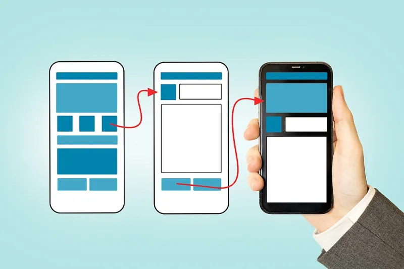
Photo: Zuko.io Images, CC BY 2.0, via Wikimedia Commons
Every month, thousands of US businesses pour money into paid traffic, refine their messaging, and polish their brand visuals — then watch helplessly as visitors leave without taking action. When conversion audits are performed on underperforming landing pages, the culprit is rarely the headline or the offer. More often than not, it is a button sitting in exactly the wrong place.
The psychology of spatial positioning on a webpage is not intuitive. What feels logical to a designer or a business owner is frequently the opposite of what a visitor's eye naturally seeks out. Understanding this gap is the first step toward closing it.
How the Human Eye Actually Reads a Web Page
Decades of eye-tracking research — conducted by organizations ranging from the Nielsen Norman Group to academic institutions studying digital behavior — consistently show that users do not read web pages the way they read books. Most visitors scan in an F-shaped or Z-shaped pattern, concentrating attention along the top horizontal band of a page, then moving down the left edge in a vertical sweep, with occasional rightward glances.
This has direct consequences for CTA placement. A button positioned in the lower-right corner of a content block, which might feel like a natural visual terminus to its creator, often falls outside the primary scanning corridor entirely. Visitors process the surrounding content and exit the page before their gaze ever lands on the action you want them to take.
High-converting pages tend to anchor CTAs along the left-to-center axis of the layout, within or immediately adjacent to the content that establishes value. The button does not sit apart from the argument — it completes it.
The Proximity Principle: Connecting Value to Action
One of the most consistently validated findings in conversion research is what practitioners refer to as the proximity principle. A call-to-action performs significantly better when it is placed in close physical proximity to the specific piece of content that creates the desire to act.
Consider a SaaS landing page promoting a project management tool. If the page lists a compelling benefit — say, reducing weekly team meetings by 40% — and the CTA button appears three scrolls below that claim, the emotional momentum generated by that statistic has largely dissipated by the time the visitor encounters the button. Placing the CTA immediately beneath or beside that specific claim captures the visitor at peak receptivity.
This principle applies across industries. A healthcare services provider in Chicago tested moving their appointment-booking button from the page footer to a position directly below their patient testimonials section. The result was a 34% increase in scheduled appointments within the first 30 days — with no changes to copy, color, or page design.
Above the Fold: Still Relevant, Often Misapplied
The concept of placing key content "above the fold" — visible without scrolling — remains valid, but it is frequently misapplied. Many businesses interpret this guidance as a mandate to cram every CTA as high on the page as possible, sometimes before any meaningful value proposition has been presented.
A button asking a cold visitor to "Start Your Free Trial" before they have read a single reason to trust the product is not above the fold in any useful sense. It is simply early. Research from conversion optimization firms consistently shows that pages offering a brief but compelling value statement before the primary CTA outperform those that lead with the button alone.
The most effective above-the-fold layouts establish a clear problem-solution framework within the first viewport, then position the CTA as the logical resolution to the tension just created. The button becomes an answer, not an interruption.
Micro-Interactions and the Role of Visual Weight
Beyond raw position, the visual weight of a CTA relative to surrounding elements plays a decisive role in whether it registers as clickable or blends into the background. Visual weight is determined by size, contrast, whitespace, and motion.
Buttons that are sized proportionally to surrounding text without adequate contrast are frequently overlooked — not because visitors are inattentive, but because the design fails to signal that the element is interactive. A button must look like a button: it should occupy enough visual real estate to be immediately identifiable, and it should contrast clearly with both the background and nearby text colors.
Micro-interactions — subtle animations triggered by hovering over a button — add a layer of behavioral reinforcement. When a button responds to a cursor by shifting color, scaling slightly, or displaying a brief shadow effect, it communicates interactivity before the click occurs. A/B tests across e-commerce and lead generation pages in the US market have shown hover-state micro-interactions lifting click-through rates by margins ranging from 8% to 22%, depending on the audience and context.
The Danger of Multiple CTAs Competing for Attention
A common mistake observed on landing pages is the presence of multiple calls-to-action of equal visual prominence. When a visitor encounters three buttons of identical size and color — one for a free trial, one for a demo, and one for a pricing page — the result is decision paralysis. Attention is divided, no single option feels urgent, and the visitor defaults to the easiest choice available: leaving.
Effective CTA architecture establishes a clear hierarchy. One primary action should dominate the visual hierarchy of each page section, with secondary options presented in a lower-contrast, text-link format that does not compete for the same visual bandwidth. This approach guides visitors along a preferred conversion path without eliminating alternatives for those who are not yet ready to commit.
Scroll Depth and the Case for Repeated Placement
For longer landing pages — those exceeding 800 words or containing multiple content sections — a single CTA placement is rarely sufficient. Visitor intent varies significantly based on where they are in the decision-making process. Some arrive ready to act and want to find the button immediately. Others require more information before committing, and they will scroll to find it.
Pages that include a CTA at the top of the primary content section, again at the midpoint following a key proof element such as a case study or statistic, and once more at the conclusion of the page consistently outperform single-CTA layouts. This is not about being aggressive — it is about meeting visitors wherever they happen to be when conviction arrives.
Translating Placement Intelligence Into Revenue
The businesses that convert at the highest rates are not necessarily those with the most sophisticated design or the most generous offers. They are the ones that have studied how their specific audience moves through a page and aligned every interactive element with the natural rhythm of that movement.
Repositioning a single CTA button is among the lowest-cost, highest-impact changes available to any business operating a landing page. No new content is required. No additional ad spend is needed. The traffic you already have simply encounters a cleaner, more intuitive path to conversion.
At PageLanding, this kind of structural optimization is where meaningful revenue recovery begins — not in the color of a button, but in understanding precisely where on the page a visitor is most ready to say yes.