What the Best-Converting Landing Pages in America Are Getting Right This Year
Photo: GeneralAB13, CC BY-SA 4.0, via Wikimedia Commons
Conversion rate benchmarks vary widely by industry, traffic source, and offer type. But when performance data from high-volume US landing pages is examined across categories — including B2B software, health and wellness, financial services, e-commerce, and professional services — a recognizable set of practices emerges among the top performers. These are not isolated design preferences. They are deliberate, data-validated decisions that compound into measurable revenue advantages.
What follows is a breakdown of the most significant patterns observed among the top-converting landing pages in the US market this year, along with the reasoning behind why each element performs as well as it does.
1. Load Time Is Treated as a Conversion Variable, Not a Technical Detail
Top-performing pages load in under 2.5 seconds on mobile devices. This is not an arbitrary benchmark — it reflects the point at which bounce rates begin climbing steeply among US mobile users, particularly those arriving from paid social and search campaigns.
What distinguishes top converters from their peers is not that they know this statistic. It is that they treat load time as a conversion optimization priority, not a back-end concern to be addressed after launch. Image compression, deferred JavaScript loading, and lean third-party script management are built into the production process rather than addressed retroactively.
Pages in the top conversion tier consistently score above 85 on Google's Core Web Vitals assessments. Pages scoring below 60 on the same metrics show conversion rates that average 30–50% lower, even when content and offer quality are comparable.
2. Mobile Layout Is Designed Independently, Not Adapted
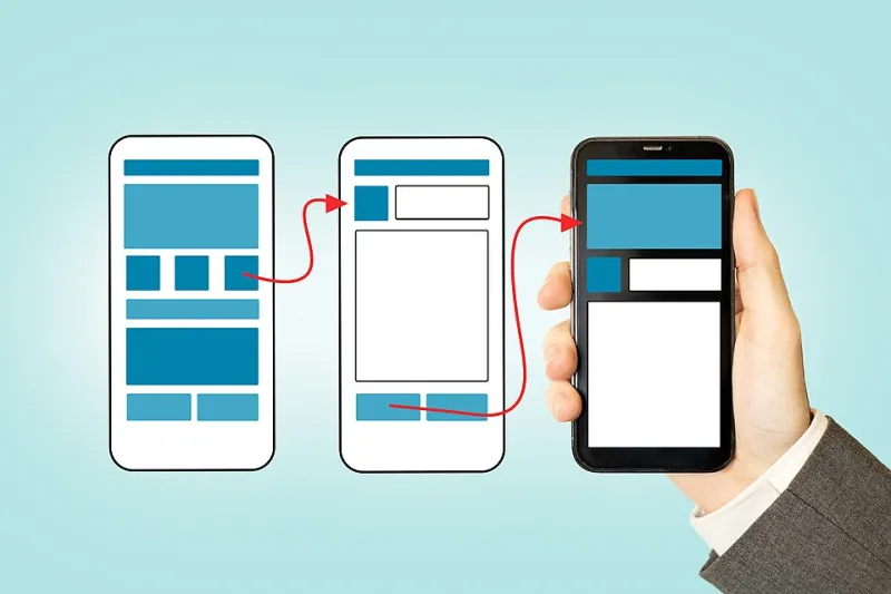
The distinction between mobile-responsive design and mobile-first design is subtle in concept but significant in outcome. Responsive design adapts a desktop layout to fit a smaller screen. Mobile-first design builds the experience for a mobile user from the ground up, with the desktop version as the secondary consideration.
Among the highest-converting pages in 2024, mobile layouts reflect an independent design philosophy. CTAs are thumb-accessible, positioned in the lower-center of the viewport where natural thumb reach is most comfortable on modern smartphones. Form fields are spaced generously to prevent accidental taps. Headlines are shorter and more direct than their desktop counterparts.
In the US, mobile devices now account for more than 60% of landing page traffic across most paid channels. Pages that treat mobile users as a primary audience — not an afterthought — reflect that reality in their conversion numbers.
3. Forms Are Shorter Than Most Businesses Are Comfortable With
The average lead generation form on a US landing page still asks for five to seven fields of information. The average form on a top-converting page asks for two or three.
This is a persistent gap, and it is driven by an understandable but costly instinct: businesses want to qualify leads before investing time in follow-up. The problem is that the form itself is often the point of maximum friction in the conversion funnel. Every additional field reduces the probability that a visitor completes the form at all.
Top performers have adopted a progressive profiling approach, collecting minimal information at the point of initial conversion and gathering additional qualifying data through subsequent interactions — follow-up emails, onboarding flows, or scheduled calls. The result is a higher volume of leads entering the pipeline, with qualification occurring at a stage where the prospect has already demonstrated intent.
4. Trust Signals Are Specific, Not Generic
Every landing page in the US market includes some form of social proof. What separates high-converting pages is the specificity and credibility of that proof.
Generic testimonials — "Great service, highly recommend!" attributed to "John D., Business Owner" — have diminishing impact in an era when consumers are increasingly skeptical of unverifiable claims. Top-converting pages feature testimonials with full names, company affiliations, and ideally a photograph or logo. They cite measurable outcomes rather than general satisfaction: "We reduced customer acquisition costs by 28% in the first quarter."
Third-party trust indicators also play an important role. Security badges, industry certifications, recognizable client logos, and media mentions all function as credibility anchors. Their placement — near the form, adjacent to the primary CTA, or in the above-the-fold section — is intentional and informed by testing.
5. Video Is Used Surgically, Not Decoratively
Video usage on landing pages has grown substantially, but the relationship between video and conversion is not straightforwardly positive. Autoplay videos with audio, background loops that add visual noise without informational value, and long-form explainers placed above the fold have all been shown to reduce conversions in controlled tests.
Top-converting pages use video in specific, high-value contexts: a 60–90 second product demonstration positioned after the primary value proposition, a customer success story embedded near the testimonials section, or a brief founder message that humanizes the brand. The video serves a defined persuasive function. It does not exist as a design element.
Pages that include a well-placed, purpose-built video in the appropriate context show average conversion lifts of 15–25% compared to text-only equivalents, according to split-test data across B2B and direct-to-consumer categories.
6. The Headline Does One Thing: Establish Immediate Relevance
Among the highest-converting pages examined this year, headline strategy is remarkably consistent. The primary headline does not attempt to be clever, comprehensive, or brand-expressive. It communicates, in plain language, who the page is for and what they will get.
This specificity matters because modern US consumers arrive at landing pages with high cognitive load and limited patience. A headline that requires interpretation — even for a fraction of a second — introduces friction. A headline that confirms, immediately, that the visitor has arrived at the right place for their specific need removes it.
The most effective headlines in 2024 are direct, benefit-oriented, and audience-specific. They read less like advertising copy and more like a confident answer to the question the visitor was already asking.
7. A/B Testing Is Continuous, Not Occasional
Perhaps the most significant structural difference between top converters and average performers is cultural rather than technical: the highest-converting pages are operated by teams that treat optimization as an ongoing discipline rather than a launch-phase activity.
These organizations run live tests at nearly all times — evaluating headline variations, CTA positions, form lengths, and page layouts simultaneously. They make decisions based on statistical significance rather than intuition, and they document results systematically to build institutional knowledge over time.
The compounding effect of continuous testing is substantial. A page that improves its conversion rate by 5% through a single test, then improves by another 5% in the following cycle, and continues that pattern over twelve months does not simply perform 60% better than it did at the start of the year. The gains stack multiplicatively, and the cumulative revenue impact over time can be transformative.
The Common Thread
What unifies these practices is a shared orientation: the visitor's experience is the primary design constraint. Top-converting pages are not built to impress stakeholders or express brand identity — they are built to reduce friction, establish trust, and make the next step obvious for the specific person the page is intended to serve.
For US businesses looking to close the gap between where their conversion rates are and where they could be, the starting point is rarely a complete redesign. It is a systematic evaluation of which of these fundamentals are missing or underperforming — and a commitment to addressing them with the same rigor that top performers bring to every page they publish.