Designing With the Scroll in Mind: How Real Browsing Behavior Should Shape Your Landing Pages

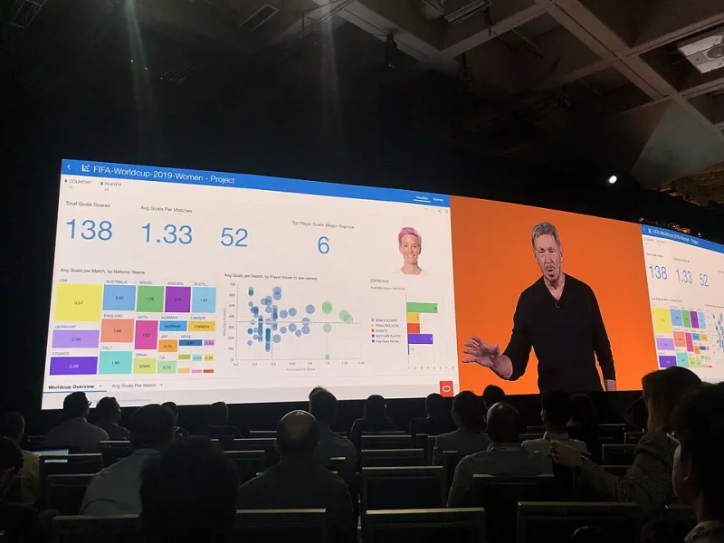
Photo: Japanexperterna.se, CC BY-SA 2.0, via Wikimedia Commons
There is a version of your landing page visitor that exists only in the imagination of the person who built the page. This hypothetical visitor arrives with focused attention, reads every paragraph from top to bottom, evaluates your offer thoughtfully, and clicks the call-to-action button at the precise moment it appears. This visitor does not exist.
The actual visitor — the one your conversions depend on — is browsing on a phone during a commute, or scanning a page between meetings, or half-watching a video on another tab while their cursor drifts through your hero section. Understanding this reality is not a reason for pessimism. It is an opportunity. Businesses that design their landing pages around genuine user behavior, rather than idealized attention spans, consistently achieve better results.
How American Browsing Habits Have Shifted
Mobile now accounts for the majority of web traffic in the United States, a threshold that was crossed several years ago and has continued to widen. According to Statista, mobile devices generated approximately 58 percent of global web traffic in 2023, with US figures tracking closely to that benchmark. This is not a trend that landing page designers can continue to treat as secondary.
Beyond device distribution, scroll behavior itself has evolved. Eye-tracking research from the Nielsen Norman Group has documented the persistence of the F-pattern and spotted-pattern reading behaviors — users scan horizontally across the top of a page, then move down the left side, occasionally darting right when something catches their attention. Extended, linear reading is the exception, not the norm.
Attention windows have also compressed. Microsoft's widely cited 2015 research suggested the average human attention span had fallen to approximately eight seconds, and while that specific figure has been contested, the directional reality is not: users make rapid judgments about whether a page merits continued engagement, and those judgments happen within the first few seconds of arrival.
The Above-the-Fold Imperative Has Not Disappeared
Despite years of discussion about the death of the fold — the argument being that modern users are comfortable scrolling — research continues to support the primacy of above-the-fold content in shaping whether a visitor stays or leaves. The fold has not lost its importance; it has simply become more complex in a multi-device environment.
What this means practically is that the content visible without scrolling on both desktop and mobile must accomplish several things simultaneously: establish relevance, communicate a clear value proposition, and create enough interest to justify continued engagement. A beautiful full-screen image with a vague tagline fails this test. A clear headline paired with a concise supporting statement and a visible call-to-action passes it.
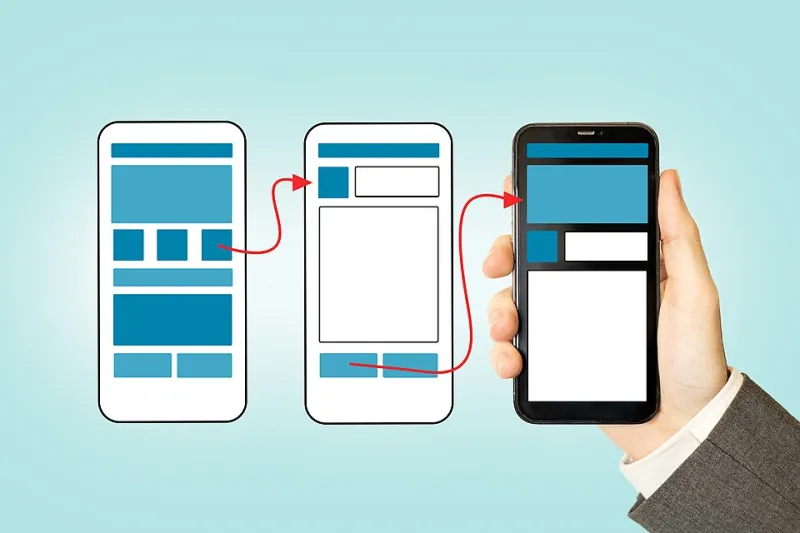
For mobile specifically, this means auditing your above-the-fold experience at 375px width — the approximate screen width of an iPhone SE, one of the most common smaller-screen devices still in active use in the US market. If your primary message and call-to-action are pushed below the fold on that screen size, a meaningful portion of your audience is arriving to an experience that does not immediately serve them.
Structuring Content for the Scanning Visitor
Given that most visitors will not read your landing page in full, the structure of your content must be designed to communicate effectively even when skimmed. This is not a concession to low-quality visitors. It is an accommodation of how all humans process digital information under normal conditions.
Several structural principles follow from this reality. Subheadings should be written to carry independent meaning — a visitor who reads only the subheadings should come away with a coherent understanding of your offer and its benefits. Body copy should front-load its most important information, following the journalistic inverted pyramid model rather than building toward a conclusion. Bullet points and numbered lists are not lazy writing; they are formats that align with how scanning eyes naturally move.
One retail brand that redesigned a product landing page in late 2023 reported a 34 percent increase in add-to-cart rates after restructuring their content hierarchy to lead with benefit-oriented subheadings and moving supporting details below a repositioned call-to-action. The offer itself did not change. The sequence in which information was presented did.
Placing CTAs Where Scrolling Actually Stops
The traditional model of placing a single call-to-action button at the end of a landing page assumes linear consumption of content. Scroll behavior data tells a different story. Session recording analysis routinely reveals that user scroll depth drops significantly before the bottom of a page — and that even visitors who do scroll fully often pause at predictable intermediate points.
Effective landing page design accounts for this by distributing calls to action at multiple scroll depths, with each placement contextually appropriate to the content surrounding it. A CTA that appears immediately after a compelling testimonial block, for example, arrives at a moment of elevated trust — which is precisely when conversion probability is highest.
Sticky or persistent CTAs — elements that remain visible as the user scrolls — have also demonstrated consistent positive effects on mobile conversion rates. When the action you want a visitor to take is never more than a tap away, the mechanical barrier to converting is reduced to near zero. The visitor's decision becomes purely psychological rather than logistical.
Matching Visual Pacing to Browsing Speed
Visual density is another dimension of landing page design that must be calibrated to actual browsing behavior. Pages that present dense blocks of text, tight line spacing, or minimal whitespace create a visual environment that feels effortful to navigate at speed. Visitors who are scanning — which is most visitors — will disengage from a visually overwhelming page faster than they will from one that uses space deliberately.
This does not mean every page should be sparse. It means that visual breathing room serves a functional purpose beyond aesthetics: it signals to the scanning visitor that the page is navigable, that information is organized, and that finding what they need will not require sustained effort.
Consistent use of whitespace around key elements — particularly headlines, calls to action, and testimonials — also directs attention by creating contrast. In a cluttered layout, everything competes for focus. In a well-spaced layout, the hierarchy of importance is visible at a glance.
Building Pages That Work With Human Behavior
The underlying principle connecting all of these considerations is alignment. Landing pages that perform well in 2024 are not necessarily the most sophisticated or the most visually striking. They are the ones most closely aligned with how their visitors actually behave when they arrive.
American web users are not going to slow down. Attention is not going to become more plentiful. Mobile browsing is not going to recede. Businesses that accept these conditions and design accordingly — structuring content for scanners, positioning CTAs for real scroll behavior, and optimizing the above-the-fold experience for the smallest common screen — will find that their pages begin working with their visitors rather than against them. And that alignment, consistently applied, is where conversion growth lives.